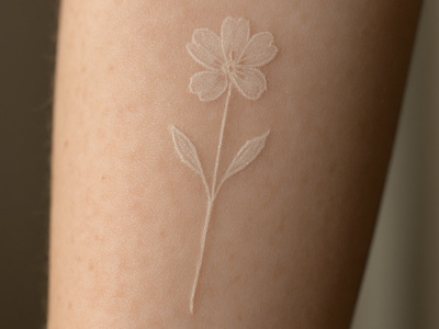
Everyone wants the delicate cursive. The thin, elegant loops you see on Pinterest boards and tattoo artist portfolios, usually wrapped around a wrist or trailing down a forearm. Then five years pass and that same tattoo looks like someone dragged a pencil through wet paper. Nobody warned them about the ink-to-font mismatch problem, and honestly, a lot of shops don’t bring it up unless you ask.
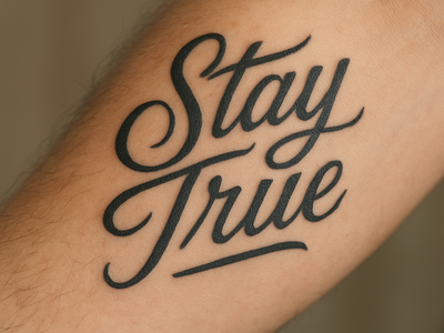
Here’s the uncomfortable truth: not all lettering styles are built for skin. Paper and screens are forgiving. Skin is not. It stretches, it ages, it absorbs ink differently depending on line thickness, and it spreads pigment slightly over time no matter how good your artist is. That means the font choice you make now is basically a bet on how well it’ll survive a decade of showers, sun, and cellular turnover.
The thin-script problem
Delicate cursive fonts, the kind with hairline strokes and dramatic thin-to-thick transitions, are gorgeous in a mockup. But those thin parts are the first to blur. Ink naturally migrates a tiny bit under the skin as it heals, and on a hairline stroke there’s zero room for that migration before letters start looking fuzzy or bleeding into each other. Give it eight or ten years and a once-crisp “forever” tattoo can read like a smudged fax.
This is especially rough on placements with more movement or sun exposure: wrists, fingers, ribs, feet. Thin script in those spots ages faster than the same font tattooed on a flatter, more protected area like the upper back or inner bicep.
What actually holds its shape
Bolder, more consistent stroke weight is the boring-but-correct answer. Block lettering, blackletter, or scripts specifically designed with tattooing in mind (a lot of tattoo-specific font packs exist for exactly this reason) tend to keep their shape because there’s more surface area for the ink to sit in evenly. If you’re set on a script style, ask your artist whether they can thicken the thinnest strokes just slightly, enough to preserve the look without setting yourself up for blowout territory later.
Size matters just as much as style. A quote that looks perfectly readable on a mockup screen can become illegible once it’s shrunk down to fit a wrist. As a rough rule, if you can’t picture the letters staying crisp at half their planned size, they’re probably too thin or too small for the placement you’ve picked.
Ask to see healed work, not just fresh photos
Fresh tattoo photos are basically the tattoo world’s version of a filtered selfie. Everything looks sharp under studio lighting on day one. What you actually want is to scroll to an artist’s healed-work folder, or ask them directly for photos of lettering pieces at the one-year mark. If they don’t have any, or get cagey about showing you, that’s useful information too.
If you’re the type who wants to sketch out lettering ideas before your appointment, a decent set of fine-tip pens makes a real difference for mocking up how bold or thin you actually want the strokes to be. Something like the Sakura Pigma Micron pen set lets you test different line weights side by side before you’re committed to one in permanent ink. It’s a five-dollar way to avoid a five-hundred-dollar regret.
For anyone who wants to go deeper on typography basics before picking a style, Google Fonts’ typography knowledge hub is a surprisingly solid, free resource, not tattoo-specific, but it’ll teach you the vocabulary (stroke weight, contrast, x-height) that makes it way easier to describe what you want to your artist instead of just pointing at a screenshot and hoping.
Lettering tattoos are some of the most requested designs out there, and for good reason. They’re personal, they’re timeless in concept even when the fonts aren’t, and they don’t need color to hit hard. Just pick the version of “timeless” that’s actually built to survive real skin, not just a well-lit photo.